
AstroPaper includes a collection of predefined color schemes that can be applied to customize the theme appearance. Each scheme defines a complete set of CSS custom properties (variables) for light and dark modes.
Table of contents
Open Table of contents
Quick Start
To apply a predefined color scheme, copy the CSS variable definitions into your theme configuration. For detailed setup instructions, see the color scheme configuration guide.
CSS Variables Reference
All color schemes use the following CSS custom properties:
| Variable | Purpose |
|---|---|
--background | Primary background color |
--foreground | Primary text color |
--accent | Accent/interactive elements (links, buttons, highlights) |
--accent-foreground | Text color on accent backgrounds |
--muted | Secondary background color for subtle sections |
--muted-foreground | Text color for secondary content |
--border | Border and divider color |
Light Schemes
Light color schemes are defined using the CSS selectors :root and [data-theme="light"].
Paper Light
Default AstroPaper light theme.
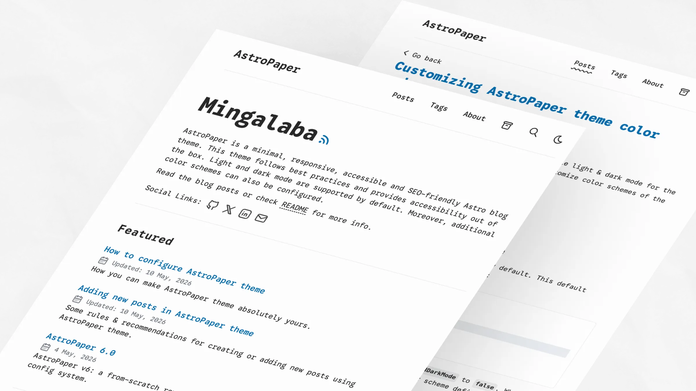
:root,
[data-theme="light"] {
  --background: #fdfdfd;
  --foreground: #282728;
  --accent: #006cac;
  --accent-foreground: #ffffff;
  --muted: #e6e6e6;
  --muted-foreground: #6b7280;
  --border: #ece9e9;
}
Kha-Yan
Purple-focused light scheme with warm background.
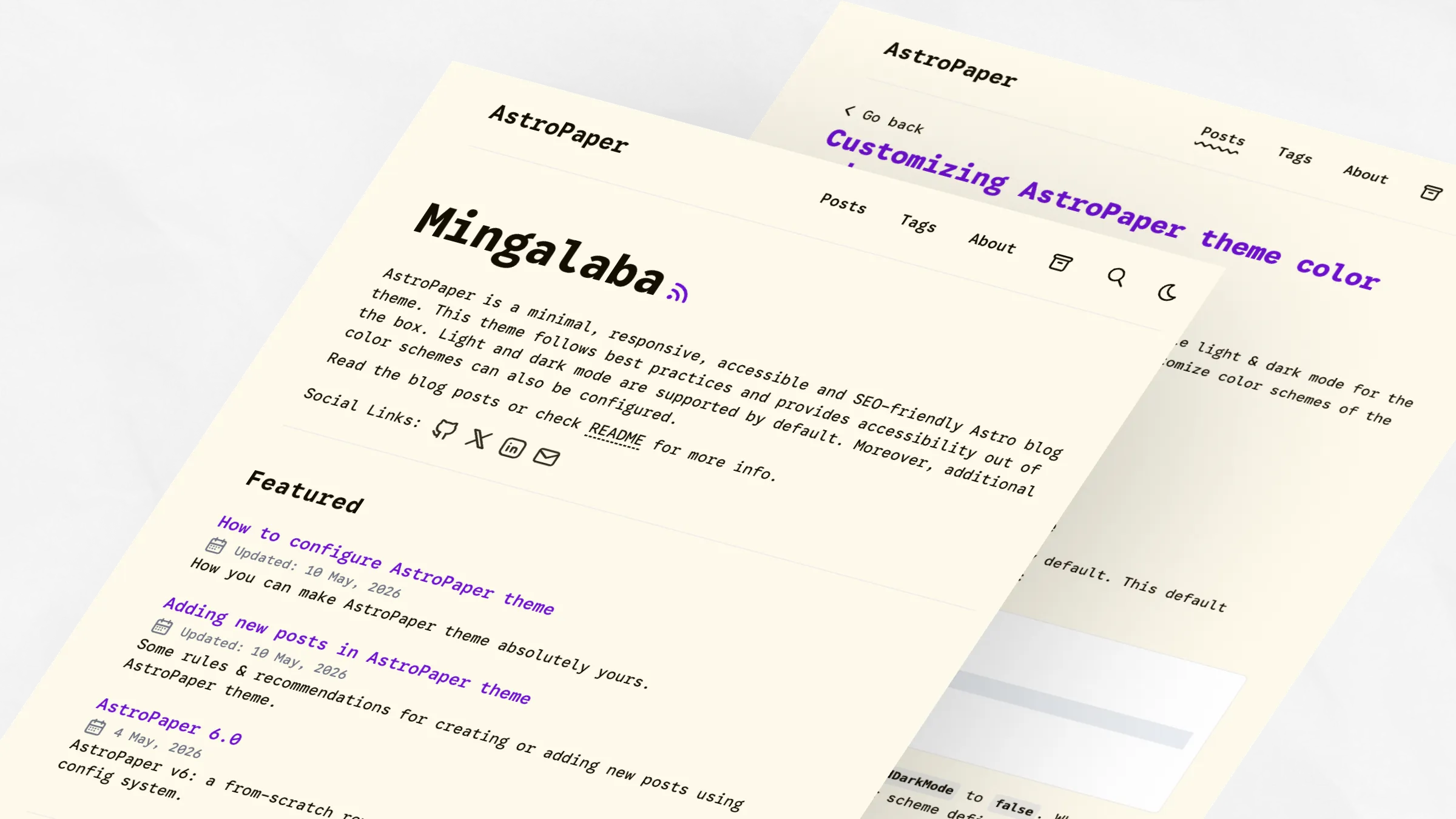
:root,
[data-theme="light"] {
  --background: #fefaec;
  --foreground: #120e01;
  --accent: #6e10cf;
  --accent-foreground: #fefaec;
  --muted: #dcdcdc;
  --muted-foreground: #6b7280;
  --border: #cdc4d6;
}
Nila
Light purple scheme with cool blue undertones.
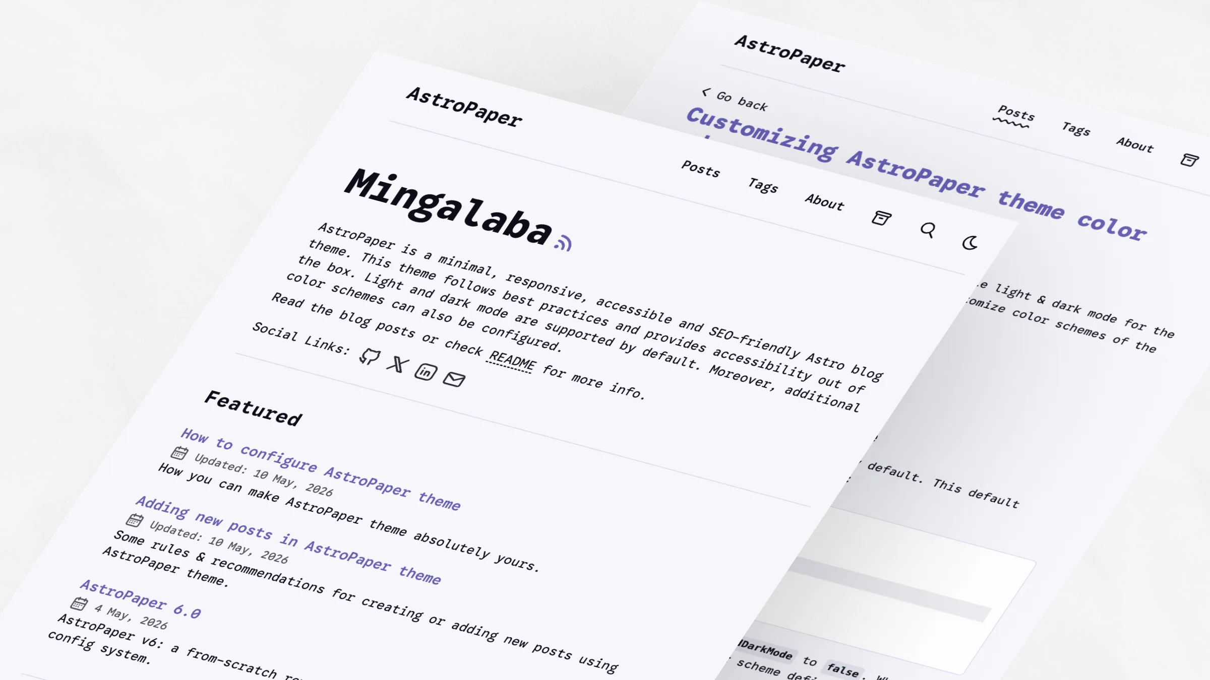
:root,
[data-theme="light"] {
  --background: #f6f6fb;
  --foreground: #0c0c19;
  --accent: #6760b4;
  --accent-foreground: #f3f3f3;
  --muted: #dddcea;
  --muted-foreground: #54515b;
  --border: #d8d6ec;
}
Jadeite
Teal-accented light scheme with neutral background.
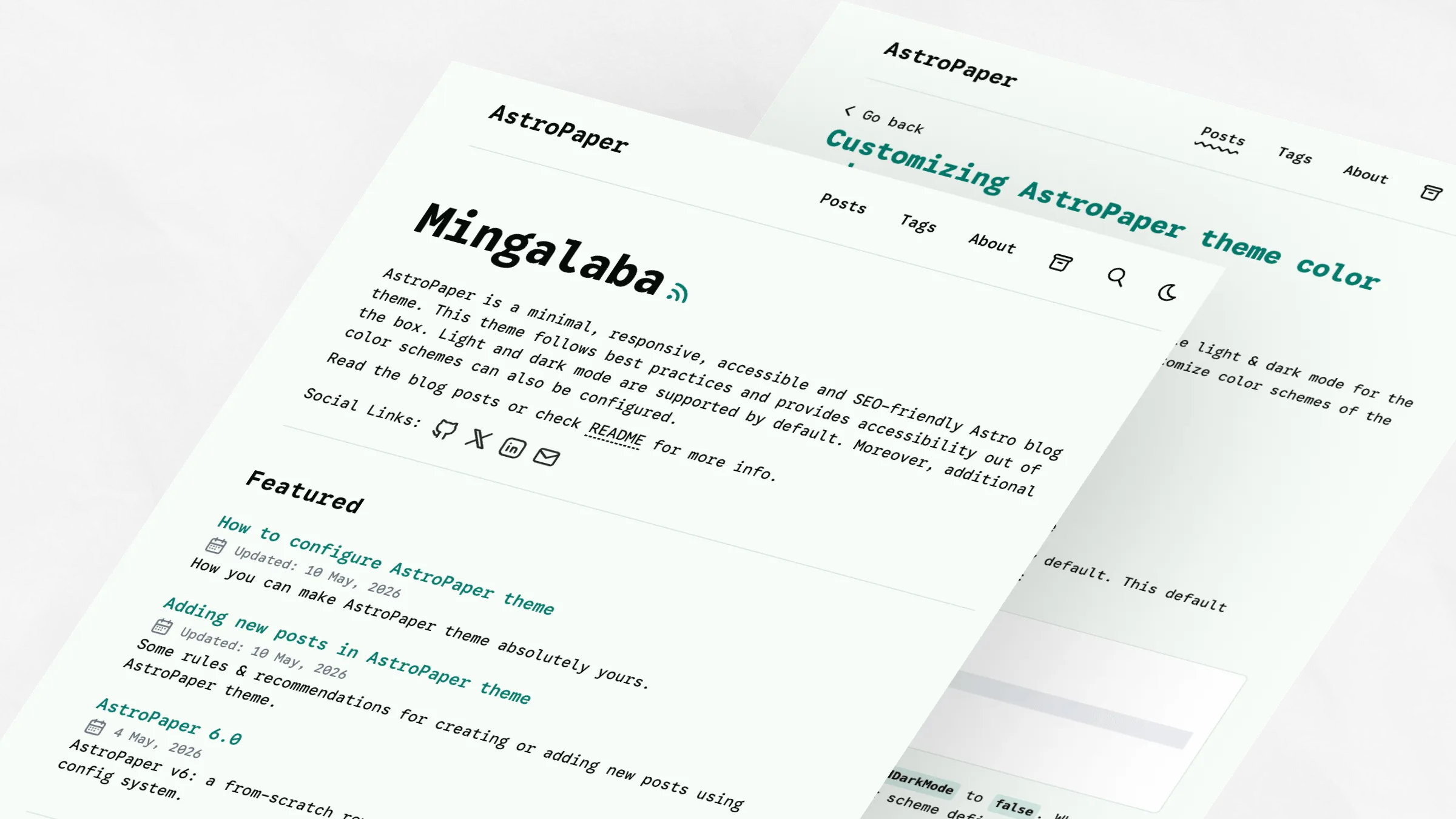
:root,
[data-theme="light"] {
  --background: #f6fcf7;
  --foreground: #060b07;
  --accent: #027c6d;
  --accent-foreground: #ffffff;
  --muted: #c9e4e2;
  --muted-foreground: #6b7280;
  --border: #d4e1df;
}
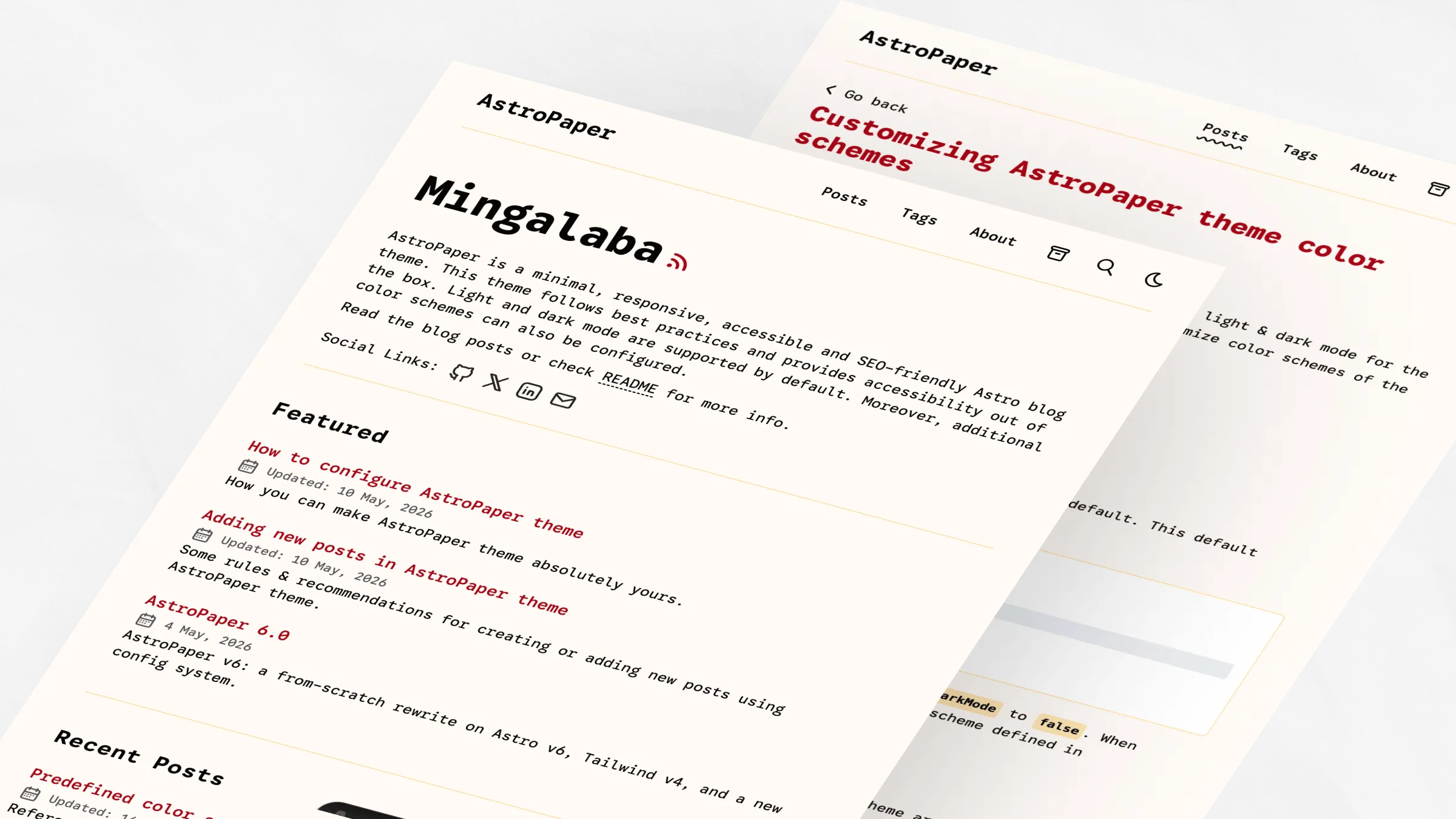
Pyit Tine Htaung
Red and gold accent scheme with warm tones.
:root,
[data-theme="light"] {
  --background: #fffaf6;
  --foreground: #060503;
  --accent: #aa0215;
  --accent-foreground: #ffcf75;
  --muted: #ffdc98;
  --muted-foreground: #54515b;
  --border: #ffdc98;
}
Dark Schemes
Dark color schemes are defined using the CSS selector [data-theme="dark"].
Paper Dark
Original AstroPaper dark theme with cyan accents.

[data-theme="dark"] {
  --background: #2f3741;
  --foreground: #e6e6e6;
  --accent: #1ad9d9;
  --accent-foreground: #0d2b2b;
  --muted: #596b81;
  --muted-foreground: #8faabb;
  --border: #3b4655;
}
Paper Dark II
Current default dark theme with orange accents.

[data-theme="dark"] {
  --background: #212737;
  --foreground: #eaedf3;
  --accent: #ff6b01;
  --accent-foreground: #ffffff;
  --muted: #343f60;
  --muted-foreground: #afb9ca;
  --border: #ab4b08;
}
Deep Purple
Vibrant magenta accents dark scheme.
[data-theme="dark"] {
  --background: #212737;
  --foreground: #eaedf3;
  --accent: #eb3fd3;
  --accent-foreground: #1a0d1a;
  --muted: #513f51;
  --muted-foreground: #c09abc;
  --border: #642451;
}
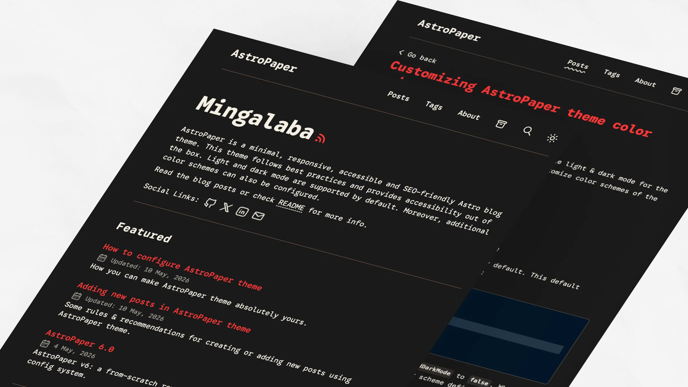
Ember
Warm, muted dark scheme with red accents.
[data-theme="dark"] {
  --background: #1a1a1a;
  --foreground: #f5efe4;
  --accent: #ff3737;
  --accent-foreground: #1a1a1a;
  --muted: #38342f;
  --muted-foreground: #a59a8c;
  --border: #6f5648;
}
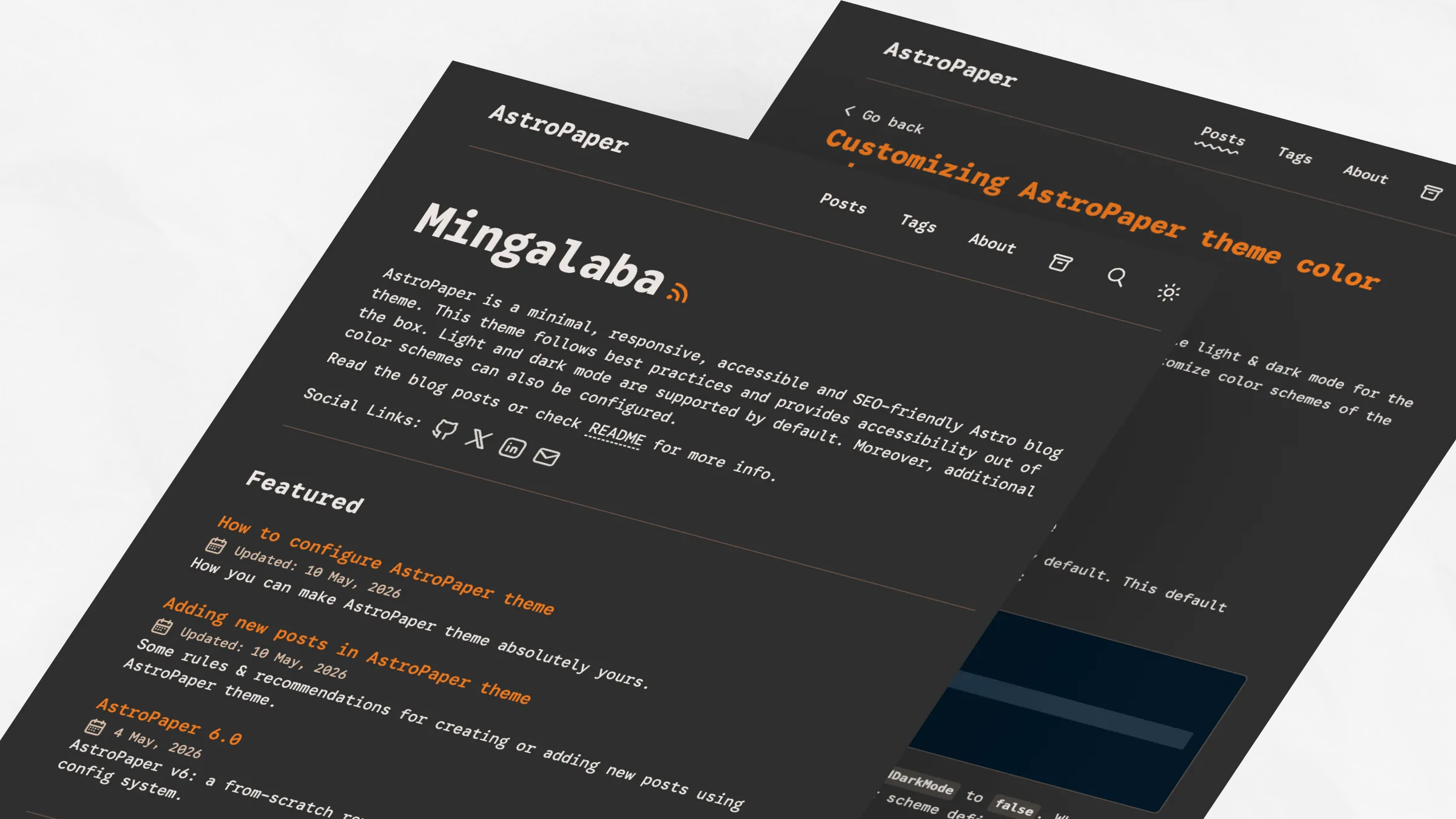
Espresso
Brown-focused warm dark scheme.
[data-theme="dark"] {
  --background: #2f2f2f;
  --foreground: #ebe5e1;
  --accent: #ee781e;
  --accent-foreground: #1a1a1a;
  --muted: #4f4b44;
  --muted-foreground: #ddbfa7;
  --border: #6f5648;
}


